A website can look good and still lose customers. A business application can technically do exactly what was agreed and still force employees into workarounds, rework and endless retyping. What's missing then is not extra functionality, but a well-thought-out user experience.
Good UX design makes the right action clear, removes unnecessary steps from a process and prevents errors before they land on an employee's desk. The result: more users reach their goal, conversion rises and the organization has time left for work that does add value.
Design is therefore not decoration at the end of a project. It is a prerequisite for a digital product that works for people and performs for the business.
What is UX design?
UX stands for user experience: the complete experience someone has with a product, service or organization. With digital products it is not only about what is on the screen, but also about the logic of the process, the speed, the content, the accessibility and what happens when something goes wrong.
The Nielsen Norman Group describes UX in a 2024 explanation as the discipline that designs and improves all interactions and the total experience for users. According to this definition, a good user experience is consistent, positive and accessible to a broad audience.
On a website, for example, UX design helps a visitor quickly understand what an organization offers and what the next step is. In a business application it helps an employee handle a case without errors. And in a customer portal it ensures someone can find, change or submit information independently.
What is the difference between UX and UI design?
UX and UI design are closely related, but not the same.
- UX design is about how things work: the steps, choices, information and interactions needed to achieve a goal.
- UI design is about the visual interface: colors, typography, buttons, icons, components and visual hierarchy.
A polished interface can inspire trust, but doesn't automatically make a cumbersome process user-friendly. Conversely, a logical process can still be confusing when important information or actions don't stand out visually.
A strong digital product needs both. UI supports the experience; UX makes sure the whole holds together.
How does UX design lead to more conversion?
Conversion occurs when a user performs the desired action. That can be a purchase, but also a quote request, registration, booking, donation, download or completed contact form.
Good UX design increases the chance of conversion by removing friction. A user doesn't have to search, hesitate or process unnecessarily much information. The next step is visible and feels logical.
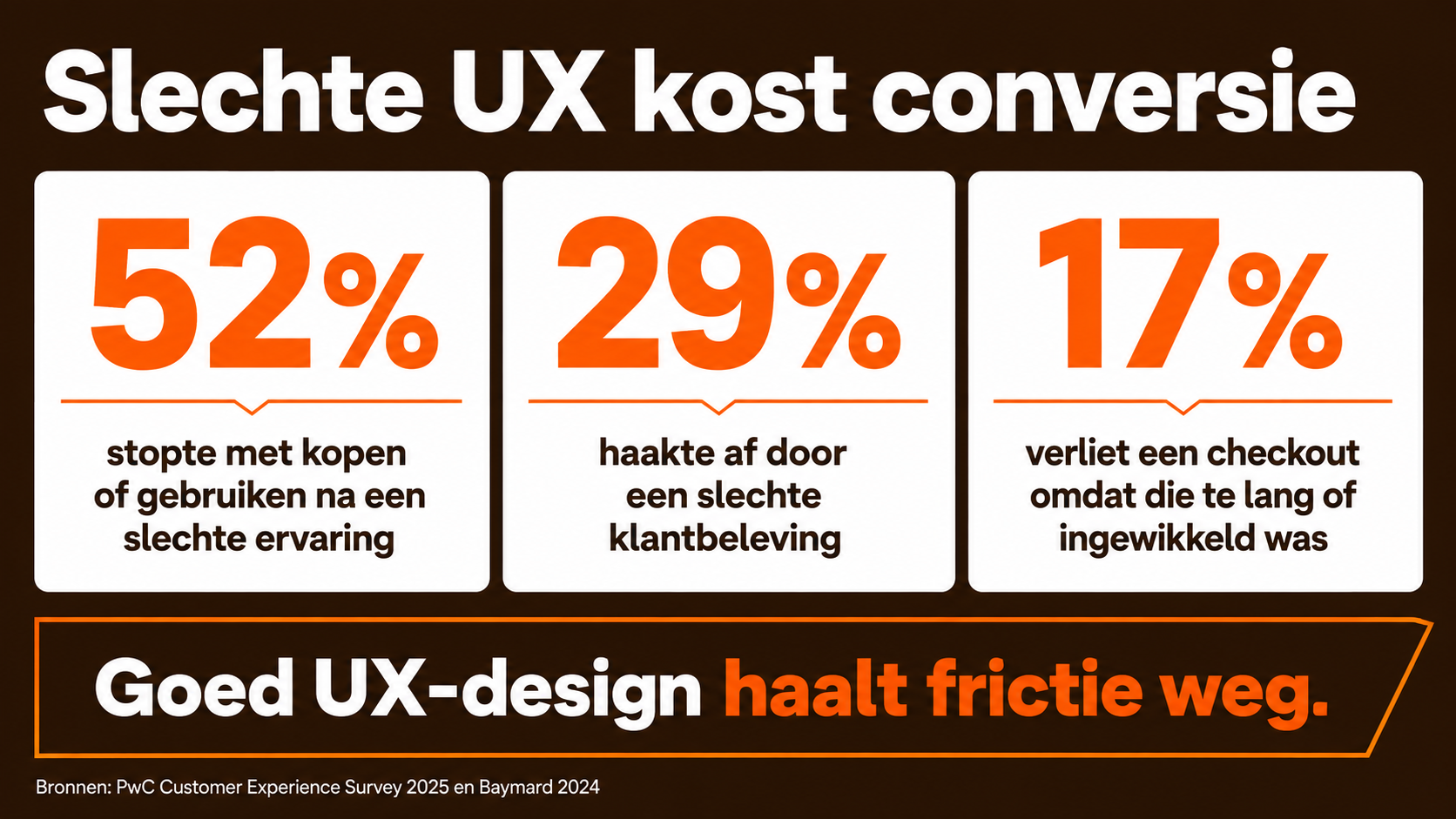
That is relevant for business. From PwC's Customer Experience Survey 2025 it appears that 52% of the surveyed consumers stopped using or buying a brand after a bad experience with the product or service. In addition, 29% name a poor customer experience, online or offline, as a reason to drop off.
Not every conversion problem is a UX problem. A price that is too high or an offer that doesn't fit won't be solved with a different button. But when people are interested and still get stuck, UX design can make a direct difference.
Make the next step unambiguous
When every button seems equally important, nothing is important. A good interface distinguishes between the primary action and supporting choices.
That doesn't mean a product may have few options. It means users don't have to think about all options at every moment. Show what is needed for the current step and postpone additional choices until they become relevant.
Ask only what you really need
Forms require mental effort. Every unnecessary question increases the chance of errors or drop-off.
The Nielsen Norman Group names in 2025 research four principles to make forms simpler: structure, transparency, clarity and support. Users must understand what is expected of them, why information is needed and how they can correct an error.
Recent e-commerce data also shows the impact. According to Baymard's 2024 research 17% of the surveyed users abandoned a checkout because the process was too long or too complicated. The number of fields turned out to matter more than the number of visible steps.
The lesson also applies to B2B websites, apps and portals: don't collect everything that might ever be handy in advance. Ask what is needed to help the user forward right now.
Provide certainty before doubt arises
People drop off when they don't know what happens after a click. Is a request sent immediately? Is someone locked into a subscription? When will a response follow? Can a choice made still be changed later?
Good UX answers such questions at the right moment. Clear microcopy, visible statuses and predictable interactions prevent users from stopping as a precaution.
How does UX design reduce manual work?
Poor UX doesn't disappear when a user closes the screen. The consequences often land with employees. They call to follow up on missing information, correct wrong input, answer recurring questions or manually transfer data to another system.
Good UX design prevents work as much as possible at the source.
1. Fewer incorrect and incomplete entries
A well-designed form makes clear what information is needed and checks input in a helpful way. Not by immediately punishing the user, but by explaining exactly what needs to be changed.
That starts with simple choices:
- understandable field names;
- examples in the right format;
- logical default values;
- showing only relevant fields;
- automatically filling in known data;
- error messages next to where the problem occurs.
Fewer input errors mean fewer corrections, fewer contact moments and more reliable data for the rest of the organization.
2. Fewer questions to customer service and support
When users don't know where their request stands or what they have to do, they get in touch. That looks like a support question, but is often the result of an unclear digital service.
The British government calls this failure demand: extra work that arises because someone cannot complete a process independently. The Digital and Data Benefits Framework from 2026 explicitly links better digital user journeys to less drop-off and less demand for support.
The British Digital Inclusion Action Plan from 2025 also names easy-to-use and inclusive digital services as a means to save people time, increase digital use and reduce failure demand.
A clear status page, understandable confirmation email or good self-service function can therefore deliver more than yet another support channel.
3. Faster internal workflows
In a business application, an employee must not only be able to view information, but above all know what needs attention and which action is required.
Good UX design helps by:
- putting relevant information together;
- preventing duplicate entry;
- clearly marking exceptions;
- automating recurring actions;
- showing only functions that fit the role;
- making the status and next step visible;
- bringing multiple systems together in one logical workflow.
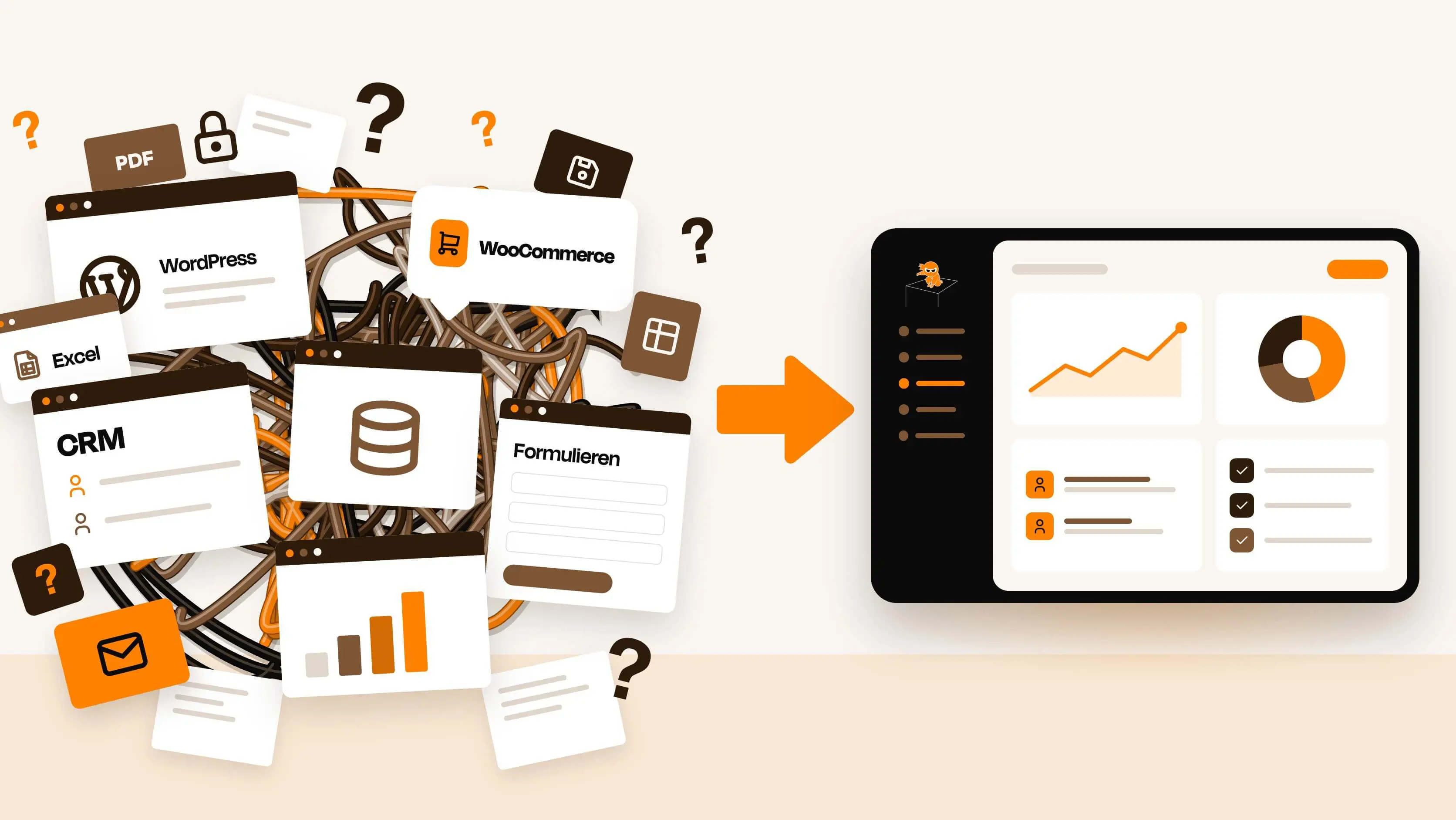
This is where design and technology meet. An efficient interface on top of five separate systems remains limited if the data behind it doesn't come together. Real time savings arise when the user experience and the digital ecosystem are designed as a whole.
4. Less training and workarounds
When new employees need weeks to understand software, that is not automatically the user's fault. Inconsistent screens, unclear terminology and processes that don't match the real work increase the learning curve.
The same applies to workarounds. As soon as employees use their own spreadsheets, notes or step-by-step plans alongside an application, that provides valuable information: the official product doesn't fully support the process. That touches not only UX, but also digital culture and technology adoption within an organization.
Good UX design doesn't make complex software childishly simple. It makes the complexity manageable and recognizable for the people who work with it.
What does good UX design deliver?
The business value of UX design usually falls into four categories:
- More conversion: more purchases, requests, bookings or registrations.
- Lower operating costs: less support, rework and manual processing.
- Higher productivity: employees perform tasks faster and with fewer errors.
- Less risk: better input, clearer decisions and more accessible processes.
The return therefore doesn't have to be visible only on the front of a website. In an internal application, five minutes saved per case can be more valuable than one percent extra website conversion.
Suppose 30 employees process 20 cases every working day. If a better workflow saves three minutes per case, more than 600 hours of capacity are freed up each month. The exact financial value depends on labor costs and what the organization can do with that time, but the impact is measurable.
That is the core: UX should not be judged on taste, but on the result the product delivers for users and the business.
Is accessible design also good for business?
Accessible design ensures as many people as possible can use a website, app or digital product. Think of sufficient contrast, keyboard operation, clear labels, understandable language and support for assistive technology.
That is relevant not only for people with a permanent disability. A user can also be temporarily or situationally limited: by bright sunlight, a broken arm, a busy environment or a small screen.
Since 28 June 2025, the requirements of the European Accessibility Act also apply to various products and services, including e-commerce, consumer banking services and electronic communications. The European Commission explained on its introduction in 2025 that this law is meant to make important products and services within the EU more accessible.
Including accessibility from the start prevents costly repairs afterwards and often leads to clearer interfaces for everyone.
How do you recognize UX problems?
A UX problem doesn't always cause an error message. The technology works, but people don't reach their goal efficiently.
Watch for these signals, among others:
- many users leave at the same step;
- forms often arrive incomplete;
- employees keep answering the same questions;
- data is manually transferred between systems;
- people use their own spreadsheets or notes alongside the application;
- mobile users drop off more often than desktop users;
- new employees need a lot of training;
- users search for information that should be prominently available;
- conversion lags while traffic and interest are present;
- improvements in one place cause new problems elsewhere.
Analytics usually tell you where people drop off. Conversations, observations and user tests help explain why. You need both to solve the right problem.
How do you improve UX without rebuilding everything?
A complete redesign isn't always necessary. Start with the user journey that has the greatest business impact.
Step 1: determine the desired outcome
'Making the website more modern' is not a measurable goal. Formulate what needs to improve, for example:
- more qualified requests;
- less drop-off during registration;
- fewer support questions about the status of a process;
- shorter processing time per case;
- fewer corrections to submitted information.
Step 2: investigate the complete user journey
Don't look only at the screens. Also include emails, phone calls, internal checks, connected systems and manual handovers. The greatest friction is often between departments or systems, out of the user's sight.
Step 3: combine data with real users
Analyze drop-off, search behavior, error messages and support questions. Then observe how real users perform the most important tasks. What people actually do often differs from what an organization expects.
Step 4: test before you fully build
Make the proposed solution tangible with a clickable prototype. That way users can perform tasks and the team can validate choices before costly development hours are spent.
Step 5: measure after going live
Compare the new situation with a baseline measurement. Measure not only satisfaction, but also behavior and business results. Think of task completion, drop-off, processing time, errors, support questions and conversion.
The Nielsen Norman Group warns in a 2026 article against reporting only UX activities, such as the number of interviews or designed screens. The value lies in business outcomes: reducing risk, lowering costs, supporting revenue or increasing productivity.
Which UX metrics are relevant?
The right measurement depends on the goal of the product. Choose a combination of user behavior and business results:
- conversion rate;
- completion rate per task;
- drop-off per process step;
- time per task or case;
- number of errors and corrections;
- support questions per 100 users;
- cost per completed request or transaction;
- use of manual workarounds;
- adoption and repeat use;
- customer or employee satisfaction.
Link every metric to a concrete goal. A shorter handling time is only valuable if quality stays the same. Fewer support questions are only positive when users actually solve their problem independently.
Why design must be involved from day one
When design is only added at the end, the most important choices have often already been made: which steps the process contains, which information is available and how systems work together. A designer can then make the result prettier, but not fundamentally simpler.
That is why Ninjible works from day one with strategy, design and technology in one team. We don't start with a screen or a pre-selected solution, but with what the organization and its users really want to achieve.
Then we design, test and build a digital product that works in practice. No pretty layer over an illogical process. No design that loses its context at handover. But a robust solution that is understandable to users, fits the systems behind it and can grow with the organization.
Consultancy quality, without the clumsiness. Less talking, more making.
Frequently asked questions about UX design
What does UX design mean?
UX design is designing and improving the complete user experience of a product or service. For digital products this concerns, among other things, the structure, content, interactions, accessibility, speed and support during the process.
How does UX design increase conversion?
UX design increases conversion by reducing ambiguity, distraction and unnecessary steps. Users understand faster what the offer is, what information is needed and what the next step brings.
How does UX design reduce manual work?
Good UX design prevents incomplete input, makes statuses clear and lets systems work together logically. Employees therefore have to correct fewer errors, follow up on information less, retype less data and answer fewer recurring questions.
What is the difference between UX and UI design?
UX design determines how a digital product works and which steps the user goes through. UI design determines how the interface looks. UI supports the visual interaction; UX safeguards whether the complete experience is logical and effective.
When is a UX redesign needed?
A UX redesign makes sense when users structurally drop off, employees do a lot of rework, processes depend on workarounds or the product no longer fits the current organization and technology. Sometimes improving one important user journey is enough; a complete rebuild isn't always necessary.
Pretty is not enough. Design must work.
A good digital product looks polished, but that is where the value only begins. It helps people decide faster, prevents errors and makes work simpler. That is how design translates into more conversion, lower costs and a better digital experience.
Ninjible designs and builds websites, business applications and digital ecosystems in which strategy, design and technology work together from the start. No demos or separate screens, but real products that scale, perform and make a measurable difference for the business.